1. What skills have you developed through this module and how effectively do you think you have applied them?
I have learnt a number of skills through doing this module as well as regaining old ones I did not use over summer.
For me, the old skills I have renewed and developed are organisation, to keep thinking back to the target audience (is my project still relevant?) and time management. I think all three of these elements are key to pushing your project and producing something you are pleased with at the end. My time management needs to be rediscovered more though. I yes this because towards the end of last year I did not stress out or panic towards the deadline as I had planned my time so carefully that it was all under control. Whereas for this module I did not have that luxury and it has definitely taught me a good lesson for the next modules and the future.
Colours in general as well as for print has been a key part of this module for me. I know have a grasp of how important colour is and what effects it can have on your piece of work. I also understand what each colour process does and when it is relevant to use it. For example, RGB if I as doing a website. For me, this was the most interesting part of the project as I had never really questioned colour before. It amazes me now to think of how I used to be - find a pretty colour and use it, no question asked about the tone or what effect it was having on my project.
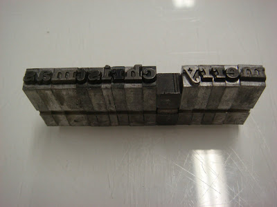
I also learnt and developed new skills through our timetabled workshops; screenprinting and letterpress. Screenprinting has always been an interest to me and I never really know how to use the process in my work. However, being forced to use two print processes in this module I have been able to discover what kind of things I can do with it and I will definitely try and use it more in my work as I love the effects you can create from it. I hope to use the drop-in sessions more this term and year so that I can experiment with it more. I was quite nervous about letterpress as I knew how fiddly it could be and how precise you have to be. However, once I was there and had picked out my font I enjoyed myself immensely. The process it not as complicated as I thought and I found it to be very rewarding. I thought about using this process in my final work, however due to the limited fonts available I decided against it as I did not want to introduce another font so late. I hope to use this process more throughout the year and if I cannot fit it into my work then perhaps I could use it for my own personal work.
Another key element to this module was the different print techniques available. I had no idea at the start of this year about print, I just thought everything used the same printers and did not realise about printing plates and colour issues. I now understand about when each printing process is relevant and how it works. I think being able to understand this and being able to relate and talk to the printers is a vital part of being a graphic designer. Having said this and realising the importance of it, I do not believe I got the most out of this part of the module and as a result I hope to work, visit a printers over the christmas period for a week or so to try and learn and understand more about these processes.
Finally, I also learnt about stock, paper weight and Pantone swatches. These 3 elements can make or break your project and I had no understanding of this fact last year. I simply picked a stock I liked and that was the end of that! Whereas now, I understand the importance of it and see the consideration which must be put in.
2. What strengths can you identify in your work and how have/will you capitalise on these?
I believe I am now more confident with colour, meaning I can work better with it and I am more willing to experiment. So what if it does not work? You can try another colour palette. I feel that my reflective evaluations throughout my project are a strength and have allowed me to refine my research and development.
3. What weaknesses can you identify in your work and how could you exploit these more fully?
My research for this project was awful. Last year I considered it to be a strength of mine throughout the year. However, during this project I did not achieve this and believe my work suffered due to it. I am definitely more determined after this module and I am going to regain my ability at researching primary and secondary information and artists. Another weakness is my time management, not through most of the project, just the end section. I have definitely learnt from my mistakes and as I have said already I am more determined than ever to address these issues and take my work forward. For this module, I believe I could go on and on about my weaknesses, however I am unsure how beneficial this would be to me. I know where I went wrong and I intend to address those issues straight away. However, one last main weakness was my handmade boxes. I was pleased with the product and the net, but when it came to making it I struggled and I believe the quality of the boxes was lost due to this.
4. Identify five things that you will do different next time and what do you expect to gain from doing these?
1. Work a lot harder. I know this is general but I believe I could work more in every aspect of my work therefore I am not being specific.
2. Regain my time management skills. Be organised from the start of this project and keep everything under control. Produce a time plan at start of project to keep me on track.
3. More and better research. Primary and secondary.
4. Experiment more. With initial ideas; with print processes; with mock-ups; with layout; with colour. The list could go on.
5. Develop my idea generation. Do not be so worried about end result as something more innovative and new could come out of the research. Be more adventurous.
6. How would you grade yourself on the following areas:(please indicate using an ‘x’) 5= excellent, 4 = very good, 3 = good, 2 = average, 1 = poor
Attendance = 4
Punctuality = 4
Motivation = 2 or 3 at start and 5 at end.
Commitment = 4
Quantity of work produced = 2
Quality of work produced = 1
Contribution to the group = 4
Answering these questions has definitely motivated me for the future. I want to put this module behind me and focus on the work ahead of me.


 Death section.


 Flower section.


