Showing posts with label Websites. Show all posts

Monday, 15 December 2008

Yes design

After learning about the new penguin books I wanted to research more into the designers who had produced the covers.

Yes design (http://www.yesstudio.co.uk) have a number of interesting and unique pieces of work to their name. I would definitely recommend a look at the website.

The three pieces of work below have been included as I feel they all have good and clever qualities to them. For example, I think the way in which 'next day delivery' has been linked to the album title (catalogue) and I am drawn to the boxes they have created from this cover image.
I included the piece below as I found the font and colour choice interesting and I believe it works with the nature of the band and music.

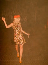
I then included this piece below simply because I liked it! I think the colour shading works well to catch your attention. I like how the image is not the first thing you see, but infact the colour.
check out the webiste!

Sunday, 7 December 2008

bonbi forest

http://www.bonbiforest.com/default.php

I have a number of 21st's coming up at the moment and I was searching for some unique pieces of jewellery and then I found this website. It is not my normal type of shop and wouldn't but much from here. However, i think the designing and layout of the website is modern, funky and interesting. Below are two items I liked. I was drawn to these due to the
aesthetics and simpleness.

Friday, 28 November 2008

www.knockknock.biz (again!)

Another fun, light-hearted product which I believe is designed well. Actually, I think the whole website and all the products are well designed and thought about.

Below are 'vouchers for lovers', a gift which enables the receiver to request desires.....

Thursday, 27 November 2008

www.knockknock.biz

On the 1st December it is going to be my boyfriend's, Steve, and my 4 year anniversary. Therefore I required a card asap.....JOY was my hero and I found a fun card to give him.....

(this is the e-card version of it but the contents is still the same)

Below are 'timing task clips'. They are knockknock's "interpretation of the standard binder clip." I found these clips to be fun, colourful, useful and just caught my eye. I would definitely use something like this product.


Thursday, 20 November 2008

an interesting website...

Quick post to say check out.....
http://www.wallspankers.com/wsartists.htm

It has loads of different illustrators on here....heaven!

Friday, 24 October 2008

last one....www.crushed.co.uk

Simply find this illustration interesting and think the bright colours work well together and create a strong contrast.

I am really drawn to this type of illustation, however I never seem able to re-create it in my own work. I do not think this is relevant to my project at the moment, however I do think it is an interesting use of colour. I limited selection of colours works well. Why confuse the piece by bringing other colours into it, stick with the same shades and tints. I also love the stock of this piece. This is definitely one thing I do need to start thinking about - what stock will work for my boxes and packaging. I also need to think about what mood and tone I am trying to portray.

more...www.crushed.co.uk

marketing and campaigns....

Samsung Belle G600 Packaging.
This is relevant to my project at the moment (tissueaid) as it is all about packaging and appealing to men and women. I have now decided to use a seperate box and colour palette for men and then another box and colour palette for women. I believe this packaging works well for women, however is it too typical and expected? pink, hearts and ribbons? I think I want to be more subtle in my approach to the gender issue. Definitely no pink for women and no blue for men. I have put this piece in as I like the type and think the colours work really well together. Compliment each other a lot. I need to work on my colour palette and find a colour which can work for my logo and corporate ID throughout all the pieces of packaging.

Thursday, 23 October 2008

www.crushed.co.uk

Just having a little search on the internet and I came across this website. I have never heard of them before however I really like their work. They are quite a diverse business doing jobs from logo design to web to illustration. Below are two pieces of their illustration work. I love this first piece as my fountain pen is very special to me! I also think this piece works well due to the repetition and colour palette. This is inspiring me to try a more visual interpretation of my TissueAid project. I am mainly focusing on the type and nets. Perhaps this would work better?


Sunday, 9 March 2008

a good photographer with a bad fact!

Whilst on Anwen's profile I found the following address, www.thelovelyroad.com, it is simply polaroid photos Scoot Hammond has taken over 5 years or so.

I love the simplicity of the pieces and the details draw you in. However, whilst enjoying this work I discovered something quite worrying.....In late 2008, Polaroid Co. plans to entirely discontinue their line of remaining polaroid films (Type 600 and Spectra are among the popular used labels).

I can't believe it!!! Polaroid is still such a popular way of recording information and images. Why would they want to stop it?
I have found this petition online which is trying to stop polaroid from doing this....
http://www.gopetition.co.uk/petitions/save-polaroid-film.html
PLEASE sign it and don't let them stop manufacturing the films! This is a classic, time-and-tried art form.

a random stumble!

After going to the 11th international contemporary artists' book fair on friday I decided to look some artists up. I was on Anwen Williams page, when I stumbled across this website, which I love! I'm drawn to all aspects of it, the jewelery itself, the website design and just the general layout. I've included the link so you have a little look yourself.....

www.helplessromantic.co.uk