Wednesday 24 December 2008

Talya Baldwin

www.illustrationweb.com

Talya Baldwin has "been working as an artist and illustrator ever since graduating from Saint Martin's College, London, with an MA in Communication Design."

Her work is a mixture of drawing, text and elements from her imagination. She uses whatever surfaces are available to her, such as old envelopes and lining paper.

I think her style is unique and interesting. I especially like the use of different papers and materials. Again she has looked into birds and I think I could develop this idea a long way. However, I am unsure whether or not this idea is appropriate to E4.


Tuesday 23 December 2008

Edward Crutchley

I was looking on www.illustrationweb.com for some inspiration for my xmas brief as I want to use drawing and illustration as my main media. I then came across Edward Crutchley.

"Edward, born in 1980, grew up in the heart of the Yorkshire Dales. After moving to London at 18, he studied Womenswear at Central St. Martins. Since his graduation in 2003 he has worked with a variety of design houses; working in both textile and print design. His influences are varied; from 60’s modernism to Elizabeathan stump work, folk art to Beardsley. A love of traditional British fabrics also informs the textural nature of his work, which is offset with a graphic simplicity." http://www.illustrationweb.com/illustrators/home_large.asp?artist_id=3305&anim=N

His clients include:
  • V & A Magazine
  • Louis Vuitton Malettier
  • Pringle of Scotland
  • Fashion Monitor
  • Cent Magazine
I find his work really interesting and eye-catching. A modern style of illustrating traditional objects and people. I am also interested in his work due to the fact that he also includes different patterns within the pieces. This adds another dimension to the work and makes you want to investigate it further. I am now thinking about looking into birds/squirrels or other creatures as my xmas project.


Monday 22 December 2008

christmas presents..

It's that time of year again when you have to think of presents for aunts, uncles and any relative you may see over the christmas period. I was panicking about what to buy until I walked into Whittards on the promenade. The shop has beautifully packaged coffee and tea, perfect presents for the relatives!

I was so taken with the packaging and designs that I went onto their website once I returned home and here are a few of there designs which I particularly like.


Sunday 21 December 2008

books, books, books

Books to look at...(a little reminder to me for when I go back to uni in January)

1. Designing Information, Harmut Bruckner, Hauschild; $132
81 pieces from Prof. Bruckner;s Munster-based information Design and Typography
course
2. Data Flow: Visualizing Information in Graphic Design, R Klnten, N Bourquin and d S
Ehmann, DieGestalten Verlag; $78
Facts and figures as diagrams
3. Grid Systems in Graphic Design (Raster Systeme), Joseph Muller-Brockmann, Niggli, $78
Revised fourth edition of JMB's classic type/layout manual

Saturday 20 December 2008

Dorest Cereals

Being back home I have wanted to spend as much time as possible in my car and with my mum, therefore a trip to Waitrose was the answer. Whilst there I found some really interesting food packaging.
Below are some unique, simple and interesting cereal packaging from Dorest Cereals. I love the overall affect all the elements have together.

Thursday 18 December 2008

CR december issue

http://www.creativereview.co.uk/crblog/cr-december-issue/
http://www.creativereview.co.uk/crblog/art-by-42-below/ (shows the full article and videos)

Check on this work by The Glue Society in Sydney. They have created a series of "artistic happenings for New Zealand vodka company 42 Below." Basically the ad campaign was that these pieces of art suddenly appeared around Australia and New Zealand.

Below you can see some examples.
Clockwise from top left: Wrapping a whole street of cars in christmas paper; a rainbow of chairs in Cardrona; 100 inflatable sex dolls that mysteriouslt appeared on Bronte Beach; a milk crate UFO that landed unannounced in Queenstown.
I love this approach of publicity. It works so well at getting people talking. I also like that the pieces work on their own too, without being linked to the vodka company. The Glue Society also produced videos of the pieces being set up and the photographs you see below have been running as regular billboard and magazine adverts.

Wednesday 17 December 2008

logo development

http://best-ad.blogspot.com/2008/08/evolution-of-logos.html - I found this blog a while back but forgot to put it up here. Anyway, this blog contains the logo development of a number of large businesses. For example I have included VW; Shell; Nokia; Apple and Fed-Ex.

I can't believe some of the original logos, especially apples! It is amazing how they have all developed. On the blog there is also the develop of Sony's logo. Now this is quite an interesting one as there is only a slight change each time and the original and todays are not very different, however the company and designers involved obviously thought the slight weight and height change to the font were key.


Tuesday 16 December 2008

Playful Type

Title: Playful Type; Ephemeral Lettering and Illustrative Fonts
Editors: R. Klanten, H. Hellige
Language: English
Release: September 2008
Price: £35,00
Format: 24 x 28 cm
Features: 240 pages, full colour, hardcover
ISBN: 978-3-89955-220-1


This book shows a selection of work by illustrators who are choosing to stick with handmade letterforms in an increasingly digital world.
This book is also going onto my christmas list!! I love seeing the unique ways people are creating type. I am especially interesting in handcrafted type, it is incredible what designers can do!

Below are few examples of the contains of the book....


Monday 15 December 2008

Yes design

After learning about the new penguin books I wanted to research more into the designers who had produced the covers.

Yes design (http://www.yesstudio.co.uk) have a number of interesting and unique pieces of work to their name. I would definitely recommend a look at the website.

The three pieces of work below have been included as I feel they all have good and clever qualities to them. For example, I think the way in which 'next day delivery' has been linked to the album title (catalogue) and I am drawn to the boxes they have created from this cover image.
I included the piece below as I found the font and colour choice interesting and I believe it works with the nature of the band and music.

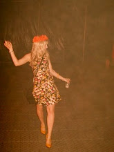
I then included this piece below simply because I liked it! I think the colour shading works well to catch your attention. I like how the image is not the first thing you see, but infact the colour.
check out the webiste!